
There were lots of attempts to grab attention at E3, many of which were flashy and, for lack of a better word, big. One of the simplest methods to reach out to people, however, was the “badge buyout” that Atlus did, showing off the two main female characters from their upcoming game Catherine. We caught up with Atlus creative designer Jeremy Cail at E3 to ask him about the eye catching badge stuffer.
[a]list: Where did the idea of the badge stuffer come from?
Jeremy Cail: Our company already has deals in place to purchase the advertising on the badge and we had to decide what game to advertise. We looked at a few different games but ultimately decided that Catherine was what we were going to push. Now, a lot of the art [for the game] is provocative; we’ve had ups and down from retailers about the proactive nature of the artwork. Things you’d think you were OK actually caused comment.
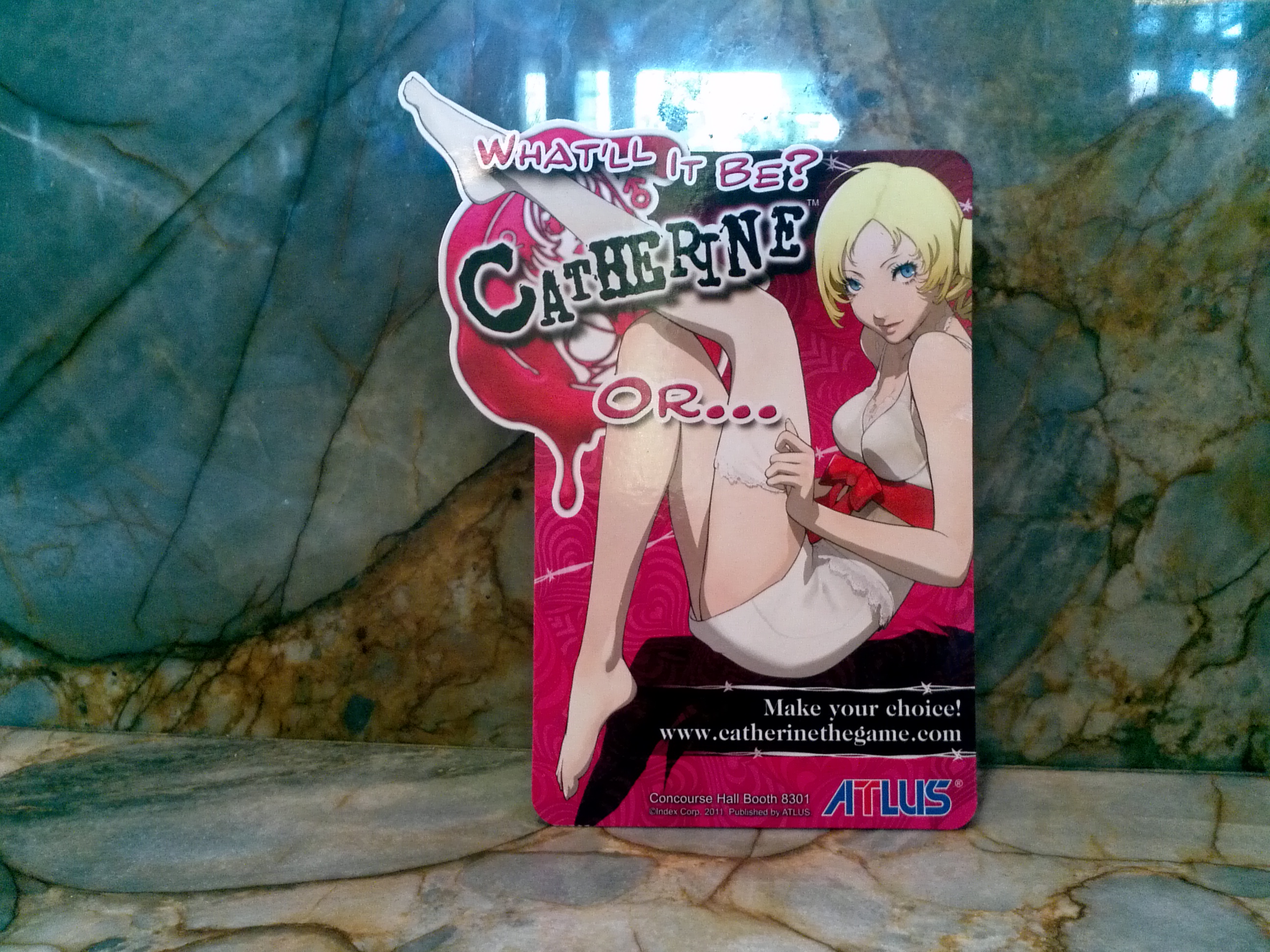 Catherine on the front…
[a]list: What do you mean Any examples you can think of?
Jeremy Cail: We have two different versions of Catherine cover art. There’s already two different versions, one for both the PS3 and Xbox 360, but the altered imagery was at the request of some our retail partners. They wanted the change in case people got the wrong idea about the game… or, as I see it, the right idea about Catherine! No change to the games themselves – the disc themselves are the same.
[a]list: Tell me about its creation and design of the Catherine badge stuffer.
Jeremy Cail: We tried another of different image, but that didn’t go through [it was the one with Catherine’s legs spread]. We couldn’t put it on the badge but we put it on [Atlus staff] shirts. We wanted people to understand the different ‘Catherines.’ We wanted something that stood out, but we wanted to make sure that people knew about the other character as well.
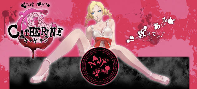 The Catherine image Atlus wanted to use originally.
[a]list: That’s interesting to think about the evolutionary process the image had to go through…
Jeremy Cail: And even this image less provocative to than you might think! Certain hemlines were lengthened before final approval.
[a]list: Interesting! What are some of the other art alterations that were made for the game?
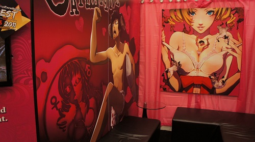
Jeremy Cail: Well, we had to eliminate Vincent from the small of the small of Katherine’s back [in some of the posters]. We did what we could to bring the art out; if it works, we try to preserve the art because having the same thing that Japanese consumers have is a thrill for our niche.
We also have to balance concerns of the original designers in Japan; maybe we’ll want to use one piece of art in this way or that, but we’ll ask them and they’ll say it wasn’t the intent to use it that sort of way. But with the badge stuffer… it took three to four iterations to get there, but people seem to like it.
[a]list: Do you think the badge sponsorship has managed to create some excitement for the game at E3?
Jeremy Cail: Oh yeah! That and we put our Concourse Hall locations! Some people think its annoying and take it out, but more often we’ll hear that not everyone got it, and we’ll ask for extra copies. We wanted to create a keepsake; like, you can use it as a bookmark if you choose. Originally, we wanted to make it out of plastic, or a peel out version, but cost determined what we’re able to do. Ultimately we got the shiny coating, which was what we really wanted.
 …and Katherine on the back.
[a]list: What do you think about the badge sponsorship as a method to spread the word about Atlus?
Jeremy Cail: We’re in a particular niche – either you don’t know anything about Atlus or you know us and like us! There was no way people could ignore this though. People see this and are like, ‘I’ve got to go find what it is!’ Two years ago we did Trauma Team and we did Rock of Ages last year but I don’t think it got the same sort of response that Catherine did!
Tune in soon for part two, where we’ll discuss more general Catherine elements and other Atlus matters.
_ _
Get a Catherine badge stuffer at E3? Like the promotion? Join the discussion on Facebook.