
Last week we talked about the Catherine badge stuffer with Atlus creative designer Jeremy Cail. This week we talk about localizing the game, the booth design for Atlus and considerations in the way box art is prepared for the U.S.
[a]list: Catherine images are all over your booth, which are in the front of the Concourse Hall. How has the game gone from being a “Japanese only release” to being what seems to be Atlus’ biggest title of the year?
Jeremy Cail: The more we saw of it, the more we wanted them to bring it over. We have an art book for the game, and we were just getting more art from them. We have special art in the art-book that we haven’t used for anything yet. But yeah, the more we saw of it, we were starved for more. [The Persona team] can be very protective, they wanted to make sure it was present the right way. But as to how it’s grown… I don’t know! I think it’s the artwork itself, which is very eye catching. You can see just about as much of Catherine as you want, but some of the most provocative art is Vincent! Why is he in underwear, why does he have horns and why is he in this strange dream world?
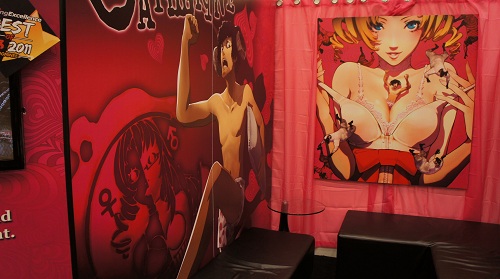 Inside of the Atlus booth.
You know, we had another discussion about the artwork on the OST CD, though ultimately the face on the CD in the U.S. version is Catherine from the Japanese CD. We know our fans want the same thing they have in Japan. Michiko Shiikuma, principal designer of the game for Atlus, was keen on making and preserving a certain sort of style. It’s tough, you see so many ways to use an element, but ultimately you have to talk to Japan about it, and often they’re like ‘don’t do that’, but sometimes they surprise us.
[a]list: What’s the response been like to the “Love is Over” collectors edition of the game?
Jeremy Cail: We like doing [collectors edition stuff] a lot because it can be difficult for a gamer to part with their money, but we wonder what is the extra thing we can do to make them interested We knew [Catherine] was going to be big and we couldn’t avoid doing something for it. Ideas go around, people throw around different ideas, the whole marketing team is on it, saying ‘yes’ ‘no’ ‘maybe’ or ‘you’re insane!’ We looked back into the game to see what we could give, the t-shirt in the set is something that Catherine wears in the game, so its a tip of the hat to those that pay attention to the game.
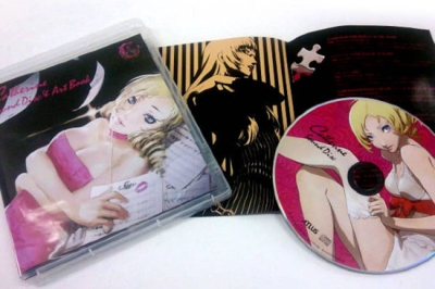 Catherine Japanese OST and artbook.
[a]list: I love the name for it by the way, taken from the ‘game over’ screen.
Jeremy Cail: It’s an interesting turn of phrase that wouldn’t be thought of by English speakers – it’s one of those great byproducts of Japanese development!
[a]list: It’s interesting that this year there’s so many Western games in the Atlus booth…
Jeremy Cail: Our own company makes quality material, but it takes time! And they’re not putting out five games a year, so we’ve got to do other things! So we’ve looked at other things like Cursed Crusade and Rock of Ages, we let they have a lot of freedom. We were encouraged to emulate the independent spirit of our Japanese parent company and Rock of Ages is a good example of that sort of unique product.
[a]list: It’s interesting actually more playable games from the West in Atlus’ booth than from Japan….
Jeremy Cail: We can’t really demo Persona 2 here. People do play those RPGs, but what we’ve got are much more accessible; Catherine‘s the lure and we let people decide what else they want to see once there here. We have multiple videos running to show our entire line up but a lot of people would never come by if it was all Shin Megami Tensei.
[a]list: Did Atlus USA know that Catherine was coming to the U.S. before it was announced?
Jeremy Cail: We had seen hints of this very nebulous thing. We get messages like, ‘We’re talking about this game where you’re haunted by this crazy girl and it’s a puzzle game’ and we’re like ‘what the hell are they making ‘ We knew they were putting a lot of time into it. And six to eight months go by before we hear anything new so it’s a surprise to us sometimes too. We trust what they’re doing, the bigger challenge is figuring out how are we going to market to the U.S. We didn’t know how were going to market a puzzle horror game – that doesn’t exist as a genre! We ask them how they classify it, but it doesn’t translate very well.”
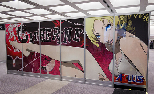 Outside the Atlus booth.
[a]list: I think there’s some elements of being past adolescence but not quite being an adult that people can relate to regardless of country of origin…
Jeremy Cail: It’s life in the fast lane! *laughs* There are certain common things that stretch across boundaries. They can relate to the experience of being trapped, so literally and figuratively that’s how the game evolves.
I liked what I saw so much that for Halloween this past year I dressed as Vincent! We always dress up as game characters for the Halloween party and take pictures but they had to black that out because the game wasn’t announced!
[a]list: Did the fan response to the game before it was confirmed for the U.S. surprise you?
Jeremy Cail: I don’t know, it’s hard to say because sometimes those decisions are made for us. There are plenty of things I’ve seen before that even thought it seems savvy, consumer response is maybe only so-so, but I think we’ve been surprised at its growth at its pre-orders. That makes us say ‘hey people are in to it.’ It’s been a pleasant surprise and it looks like people are warming to it.
[a]list: Ah yes pre-orders, one of the few objective measures of a game before it releases to stores.
Jeremy Cail: It tells retailers the story as well, and it helps us to work with them. We just try and make it look pretty. I want to make something that people will pick up and turn over, make something with a screen shot that people can relate to and get something out of.
[a]list: I’m sure that’s an interesting discussion right there over what to do with the cover art.
Jeremy Cail: When you look at [the box art for Catherine] we took at mentality of, ‘If it ain’t broke don’t fix it.’ But sometimes we don’t think the art will stand out for the game; you look at how people are getting excited but that image on the shelf just doesn’t pop. People might make certain assumptions about the game that may not be true. We looked at Persona 3‘s cover art years ago and we thought, ‘This is going to die on the shelf.’ It’s beautiful, but it didn’t stand out and nobody can see this thing looking at it from the top, rifling through a stack. There was a decision that we were going to make it ritzier and we reworked. It wasn’t popular with some people who knew the franchise, but some people who didn’t know Persona liked it; we ultimately went with the potential for the larger audience. The original cover came out on the back of the game box, so you saw the entire composition and I thought we made the right decision.
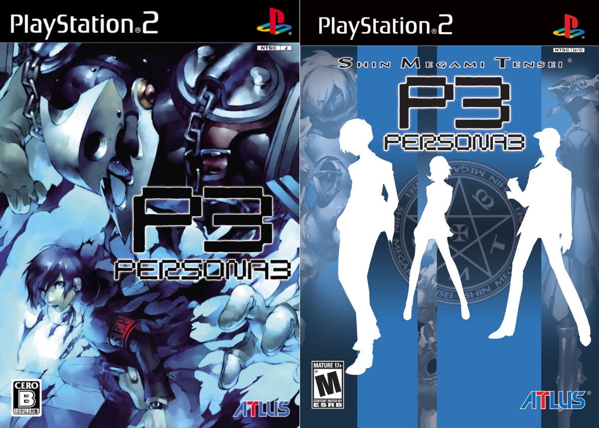 Japanese and U.S. box art for Persona 3.
[a]list: Ah, so you’ve worked on a couple of the Persona games.
Jeremy Cail: It’s funny, because I was familiar with the Persona series – I had been given a copy of the first game back before I even worked at Atlus and I remember that I didn’t like the artwork. So it’s ironic then that I would be give the opportunity to personally oversee the artwork for the cover of Persona 3 and Persona 4!
I wasn’t hot and heavy on Persona 4‘s cover art, but we were trying to push back on what the fanbase of the game had said the want. There was some bumming over Persona 4 being a PS2 game and I don’t think we published a PS3 game until…. gosh, was it 3D Dot Heroes No, it was Demon’s Souls. Anyway, we went title high on that. Japan often likes title low look, but in this case it was almost identical.
[a]list: I’m sure that’s a consideration dictated to by a lot of variables.
Jeremy Cail: A lot of times with the ESRB logo and our own logo low that forces us to push [the game logo] up a bit.
[a]list: Anyway, thank you for your time Jeremy and good luck with Catherine!
_ _
Interested in Catherine? Dig the new lineup for Atlus? Join the discussion on Facebook.